As the first of an ongoing series of posts, I am going to include snippets and drafts of our creative processes working with designers to get our product out to our, market – starting with our very first design job – our Outlier Cartel logo.
Coming up with our logo was a big deal, and also took a great deal of time. I didn’t realise how long the design process was until I looked at our emails and our trello board – we started hunting for ideas in June 2015 and didn’t finish it until October 2015 – slightly over 4 months. It was the longest we ever took to design something, but since this would appear on all packaging – it was something we had to get right.
First of – just to clarify. I do not claim an particular graphic design design skills. I also have find working with Agencies odious (typical response: Hey mate, if you want to survive in the beer industry, chuck down $100,000K and we’ll make it happen. Just sign here and we’ll get started…) .We knew that would have to boot strap this, and get our concept tight and then hunt down an awesome designer that shared our vision.
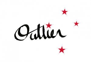
Here was the first concept we discussed:
hi Carlos, I’ve just done a couple of quick ones with Barbara’s calligraphy pen. I thought it would be good to link the O with the t, to give it strength, connection and efficiently. I thought have the southern cross as the i-dot would be a nice tie-in to New Zealand, an outlier nation. Not set in stone, but would like to get your thoughts!
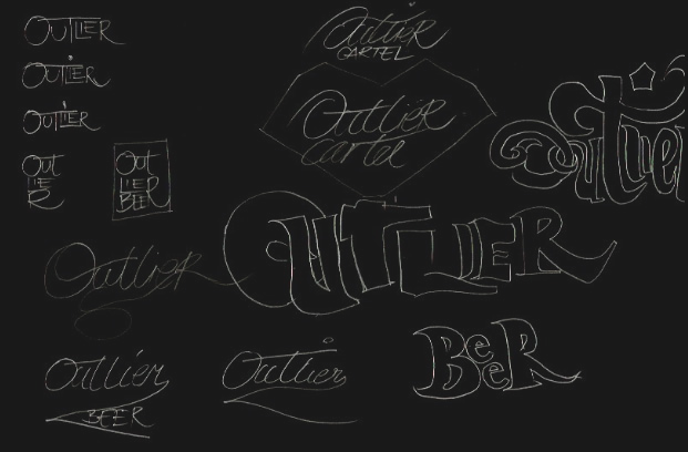
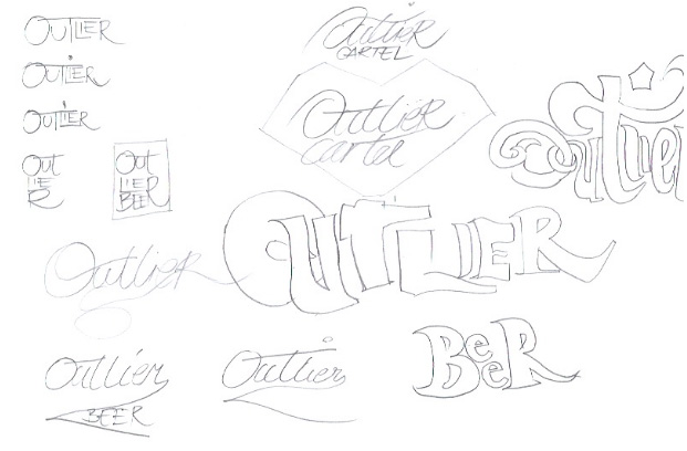
After some ongoing discussion, we decided against the southern cross, design-wise it was a bit too hard to get right, and perhaps we felt the it was too connected to the NZ Flag referendum going on at the time. In the end we decided to go for just text; we know that there would be a strong artwork focus on our package, so having symbols on our logo would potentially make our packaging too busy. So it was back to some crude scribbling and talking fonts. Being a baseball fan from the 1980s gave me my initial inspiration. Carlos also contributed a some new concepts which we drew on some paper. Below are some our proto sketches:
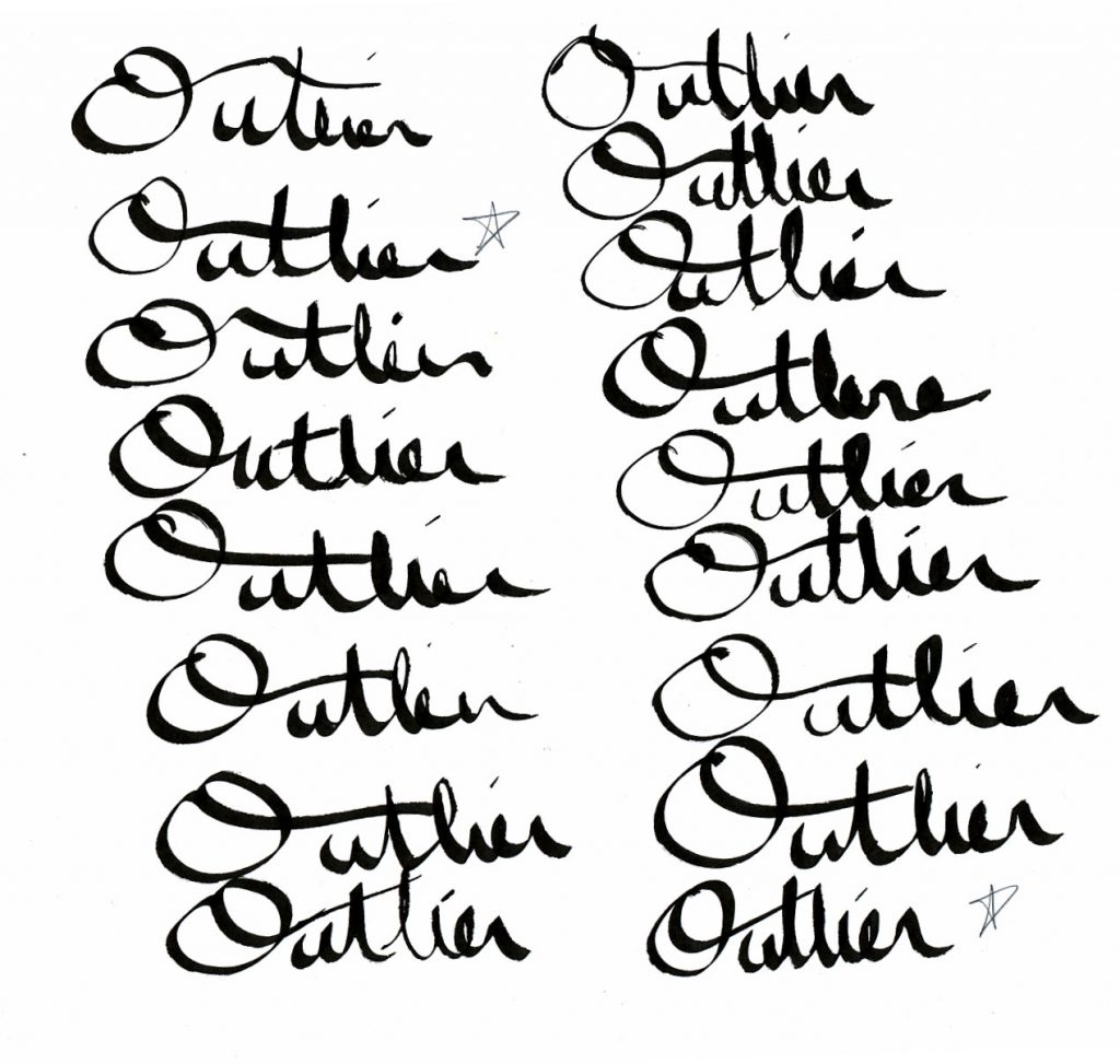
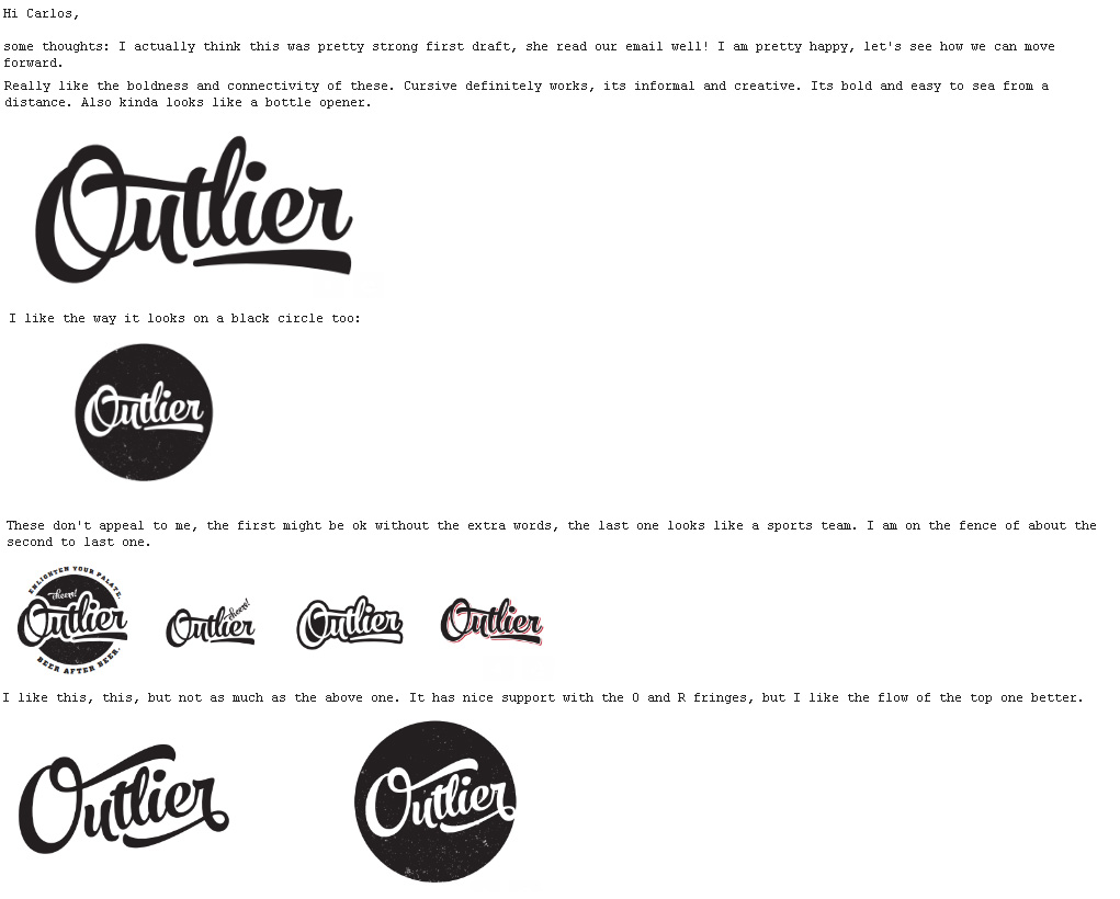
Fast forward a few months later, and we were having trouble finding the ‘right’ designer for this project. Carlos contacted a colleague in Vienna, Austria who did work for Red Bull. Her name is Carita Najewitz and she came immediately with some great work. Here’s a screenshot of an email of some of her logo concepts we reviewed.
Carita was awesome to work with and we soon had the logo that we were proud to put on all our bottles! What you see below, is on our website and bottles.
